
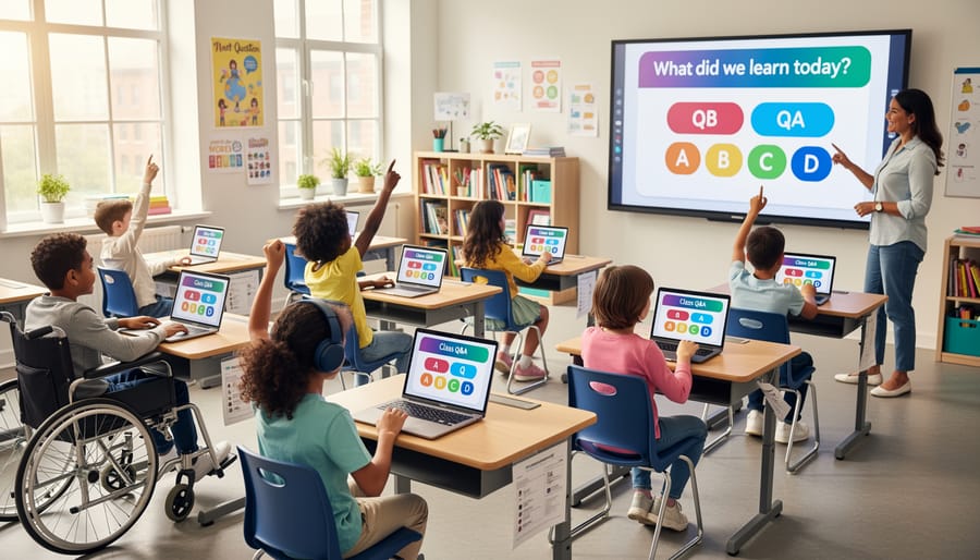
Make Your Q&A Slides Work for Every Student in Your Classroom
Design Q&A slides with high contrast color combinations—aim for a minimum 4.5:1 ratio between text and background so all students can read questions clearly, even those with visual impairments or color blindness. Choose dark text on light backgrounds or vice versa, avoiding color-only cues to convey meaning.
Structure each slide with one question per screen and leave generous white space around text blocks. This helps students with attention difficulties focus and gives screen readers clean paths to follow. Keep font sizes at 24 points minimum for body text and 36+ for questions.
Test your slides by navigating them using only your keyboard—press Tab to move through answer choices and Enter to select. If you can’t reach every interactive element this way, students using assistive technology won’t either. Add clear focus indicators so everyone knows which answer they’re selecting.
Create predictable layouts where questions always appear in the same spot and answer choices follow consistent patterns. This reduces cognitive load for students with learning differences and lets everyone participate confidently. When students know what to expect, they can focus on demonstrating their knowledge instead of decoding your slide format.
Why Q&A Slides Need Accessibility Features
Creating an inclusive classroom means every student can participate fully, and that starts with the materials we use. When we design Q&A slides for games and activities, accessibility features aren’t just nice extras—they’re essential tools that help all learners succeed.
Traditional Q&A slide designs often create unexpected barriers. Students with visual impairments might struggle to read small text or distinguish between low-contrast colors. Those with hearing challenges can miss out when information is only presented through audio cues or verbal instructions. Students with cognitive differences may need extra processing time or clearer visual organization to follow along. And for learners with motor challenges, tiny clickable areas or complex navigation can make participation frustrating or impossible.
Here’s the good news: accessible design benefits everyone, not just students with identified needs. When you use larger fonts, your entire class can read questions from the back row. Clear color contrast helps students stay focused in bright classrooms. Simple, predictable layouts reduce cognitive load for all learners, making your activities run more smoothly.
Making your Q&A slides accessible also sends a powerful message about your classroom values. When every student can participate independently, you’re building confidence and fostering a genuine sense of belonging. Plus, many accessibility features are surprisingly simple to implement once you know what to look for.
The best part? You don’t need to be a design expert or start from scratch. With the right approach and some thoughtful customization, you can create Q&A slides that engage every learner in your classroom while keeping the fun and excitement that makes these activities so effective.
The Building Blocks of Accessible Q&A Slides
Readable Text That Everyone Can See
Making your Q&A slides readable for everyone isn’t complicated, and it makes a huge difference for your students! Let’s walk through some simple guidelines that work wonders.
Start with font choices that are easy on the eyes. Stick with clean, simple fonts like Arial, Verdana, or Calibri. These sans-serif options are much easier to read on screens than fancy decorative fonts. Save those special fonts for party invitations, not classroom slides!
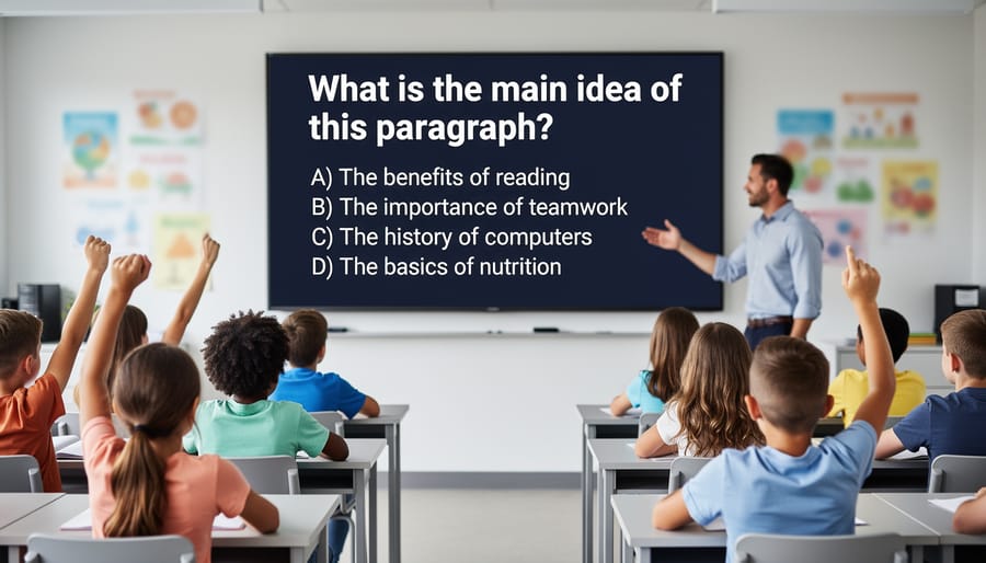
Size matters more than you might think. Your question text should be at least 24 points, and answer choices need to be 20 points minimum. If you’re presenting to a large classroom or students are viewing from various distances, go bigger. A good rule of thumb: if you need to squint, your students definitely do.
Contrast is your best friend for legibility. Dark text on a light background works great, like black or navy blue on white or cream. If you prefer dark backgrounds, use white or bright yellow text. Avoid tricky combinations like red on green or light gray on white, which can be nearly impossible for some students to read.
Don’t forget about spacing! Cramming too much text together creates visual chaos. Leave plenty of breathing room between answer choices and around your questions. Think of it as giving each element its own personal space bubble. Line spacing of at least 1.5 makes a noticeable difference, and generous margins keep everything comfortable to view.
These small adjustments create slides that truly work for everyone in your classroom!
Color Choices That Actually Work
Choosing the right colors for your Q&A slides makes a huge difference for every student in your classroom. Start with high contrast combinations like dark text on light backgrounds or vice versa. Black on white or navy on cream are tried-and-true winners that work beautifully for nearly everyone.
Here’s a game-changer: avoid relying solely on color to convey meaning. If you’re using green for correct answers and red for incorrect ones, add symbols too. Try checkmarks, stars, or happy faces for correct responses, and X marks or thoughtful question marks for ones that need another try. This approach helps students with colorblindness and creates a richer visual experience for all learners.
When selecting your palette, stick to three colors maximum for your main design. Too many colors can feel overwhelming and distracting. Pick one main color for your text, one for backgrounds, and one accent color for highlights or important information.
Want to test if your colors work? Squint at your slide or step back from your screen. Can you still read everything easily? If yes, you’re on the right track. You can also use free online contrast checkers to verify your combinations meet accessibility standards.
Remember that customization is your friend here. Many Q&A templates let you adjust colors easily, so experiment until you find combinations that feel right for your classroom style while keeping readability front and center. Your students will thank you with better engagement and participation.
Layout and Navigation Made Simple
Think of your Q&A slides as a familiar classroom where students know exactly where to find everything. When navigation is predictable, students can focus on learning instead of hunting for buttons!
Start with consistency across all your slides. Place answer buttons in the same spot every time, whether that’s centered below the question or aligned vertically on one side. When students see the same layout pattern repeated, they develop confidence and spend less energy figuring out where to click next.
White space is your best friend here. Give your elements room to breathe! Crowded slides create visual chaos and make it harder for students with attention difficulties or visual processing challenges to locate important information. Aim for generous margins and spacing between question text, answer choices, and navigation buttons.
Keep your flow logical and straightforward. Students should never wonder “what do I do next?” Use clear labels like “Next Question” or “Check Answer” rather than symbols alone. Position these navigation elements where eyes naturally travel, typically the bottom right corner for moving forward.
Here’s a quick win: limit each slide to one question with its answer choices. Resist the temptation to cram multiple questions onto a single slide. This single-focus approach reduces cognitive load and helps all learners, especially those who process information more slowly or get overwhelmed by busy visuals.
Test your layout by stepping back from your screen. Can you immediately identify the question, the answer options, and how to proceed? If you have to search for these elements, your students definitely will too!
Customizing Q&A Templates Without Breaking Accessibility
Good news! You can totally make Q&A templates your own without sacrificing accessibility. The key is knowing which elements are safe to personalize and which ones need special care.
Let’s start with what you can freely customize. Colors are great to adjust, as long as you maintain strong contrast between text and backgrounds. Think dark text on light backgrounds or vice versa. You can also change fonts to match your classroom theme, but stick with clean, easy-to-read options like Arial, Verdana, or Comic Sans. Adding your own images, icons, and decorative elements is perfectly fine too, just remember to keep your slide layout uncluttered.
Here’s what requires extra attention. If you’re changing font sizes, make sure your text stays large enough for everyone to read comfortably. Nothing smaller than 18 points for body text is a good rule of thumb. When adjusting button sizes or clickable areas, keep them big and finger-friendly for students using touchscreens or those with motor skill differences. If your template uses color coding for correct and incorrect answers, add symbols or text labels too so color isn’t the only indicator.
Now for the things to avoid. Don’t remove or disable keyboard navigation features, even if they seem hidden. Some students rely on these to move through your slides. Avoid placing text over busy background images where it becomes hard to read. And resist the urge to use fancy, decorative fonts for important information like questions or answer choices.
A simple test before using your customized template: Can you read everything clearly from across the room? Can you navigate through it using only your keyboard? If yes to both, you’re good to go! Your personalized, accessible Q&A slides are ready to engage every learner in your classroom.
Quick Accessibility Checks Before You Present
Before you hit present, take two minutes to run through this simple accessibility checklist. You don’t need any special tools or technical knowledge—just your eyes and a quick review of your slides!
Start with the squint test. Step back from your screen or squint your eyes slightly. Can you still read the text? If headings and questions blur together, your contrast needs a boost. This quick check helps ensure students with visual impairments or those sitting at the back of the classroom can see everything clearly.
Next, check your color choices. Are you using color alone to show correct answers or highlight important information? Try viewing your slides in grayscale mode for a moment. If you can’t tell which answer is correct without color, add text labels like “Correct!” or use symbols like checkmarks alongside your color coding.
Read through your text out loud. Does everything make sense? Screen readers will read your content exactly as written, so clear, complete sentences help all students follow along. Avoid phrases like “click here” without context—instead, try “Select your answer below.”
Test your fonts by zooming in to 150 percent. Does the text still look good, or does it overlap and become messy? Choose clean, simple fonts that stay readable when enlarged. Avoid decorative fonts that might look fun but create barriers for students with dyslexia or reading challenges.
Finally, give your slides a quick navigation test. Can you move through them using just your keyboard? Press Tab to move between elements and Enter to select. This ensures students using assistive technology can participate fully in your Q&A activities.
These five quick checks take minimal time but make a maximum difference for student inclusion!
Real Classroom Wins with Accessible Q&A Slides
Teachers across grade levels are discovering some wonderful surprises when they switch to accessible Q&A slide designs. Take Mrs. Rodriguez’s third-grade class, where she noticed that her student with ADHD stayed focused much longer during question sessions. Why? The clean, distraction-free slides with high contrast kept everyone’s attention where it belonged. What started as an accommodation for one student ended up helping the whole class participate better.
In a high school history class, Mr. Chen found that his shy students finally started raising their hands more often. The clear, easy-to-read slides with simple fonts made questions less intimidating to process. Students felt more confident when they could actually see and understand what was being asked without squinting or getting confused by fancy animations.
Middle school teacher Ms. Park shared an unexpected win: her English language learners became more active participants. By using accessible design principles like adequate spacing and straightforward layouts, students had extra processing time to understand questions. The bonus? Native English speakers also appreciated having more time to think through their responses.
Perhaps the best surprise comes from classrooms with students who have visual processing challenges. When teachers removed cluttered backgrounds and used proper color contrast, participation jumped across the board. Students who previously seemed disengaged were suddenly eager to answer questions. The lesson? Designing for accessibility creates a better learning experience for everyone, not just students with identified needs. Small design changes create big classroom wins.
Making your Q&A slides accessible isn’t extra work—it’s smart design that benefits every single student in your classroom. When you choose clear fonts, vibrant colors, and simple layouts from the start, you’re not just checking a compliance box. You’re creating materials that engage visual learners, support students with reading challenges, and help everyone focus on what matters most: learning and participating. Accessible design is inclusive teaching in action, and it makes your classroom a welcoming space where all students can shine. Start with accessibility as your foundation, and watch your Q&A sessions become more interactive and successful for everyone!