How the Best PowerPoint Designs Transform Review Games into Classroom Magic
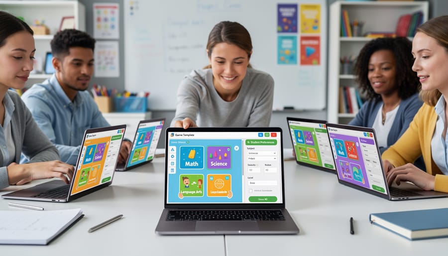
Browse templates from platforms like Slides Carnival, SlidesMania, and Canva’s education section to discover classroom-ready game designs that save hours of creation time. These collections showcase color schemes, fonts, and layouts proven to capture student attention while maintaining professional quality you can customize in minutes.
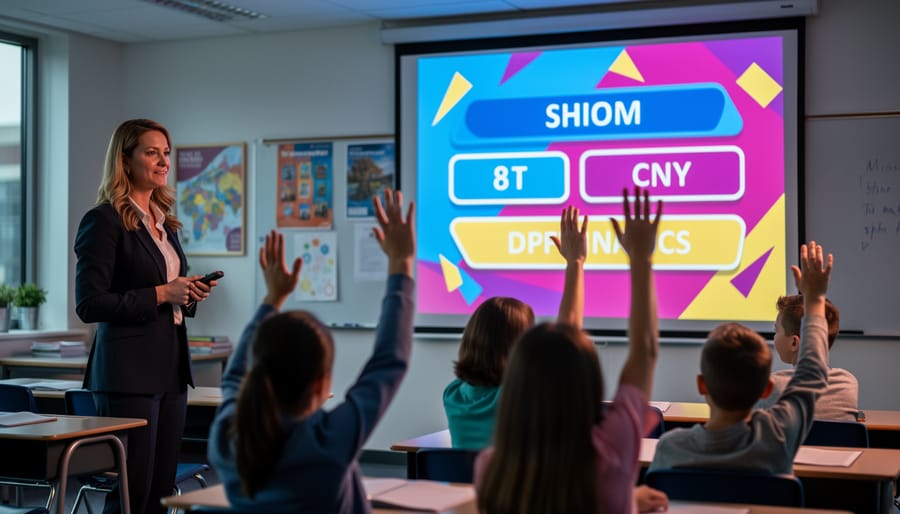
Focus on three design elements that transform ordinary slides into engaging game experiences: bold, contrasting colors that pop on classroom screens, large readable fonts students can see from any seat, and clean layouts with minimal text that keep the focus on gameplay. Game show formats work especially well because students already recognize the visual language from popular TV shows.
Steal design ideas from successful game templates by analyzing what makes them work. Notice how the best designs use consistent button styles, clear point displays, and animated transitions that build excitement without overwhelming content. Take screenshots of elements you love and recreate simplified versions that match your teaching style.
Start with pre-designed templates rather than blank slides. Customizing existing designs lets you maintain visual appeal while adding your specific content, questions, and classroom rules. Change colors to match your subject area, swap images for relevant examples, and adjust text to fit your students’ reading levels. This approach delivers professional results in a fraction of the time while keeping your games fresh and visually exciting for every lesson.
Why Design Actually Matters in Your Classroom Games
Here’s the truth: your students notice design, even if they don’t say it out loud. When you launch a classroom game with bright colors, clear text, and visuals that pop, you’ll see heads perk up and hands shoot into the air. But flash a cluttered slide with tiny font and mismatched colors? You might as well be asking them to read the dictionary for fun.
Design isn’t just about making things pretty. It’s about creating interactive slide decks that communicate clearly and grab attention from the moment you hit play. When students can easily read questions, understand the game structure at a glance, and feel visually excited about participating, they’re already halfway to being engaged.
Think about it from their perspective. A well-designed game signals that this activity matters and that you’ve put thought into making it enjoyable. Poor design sends the opposite message, making even the most creative content feel like just another worksheet in disguise.
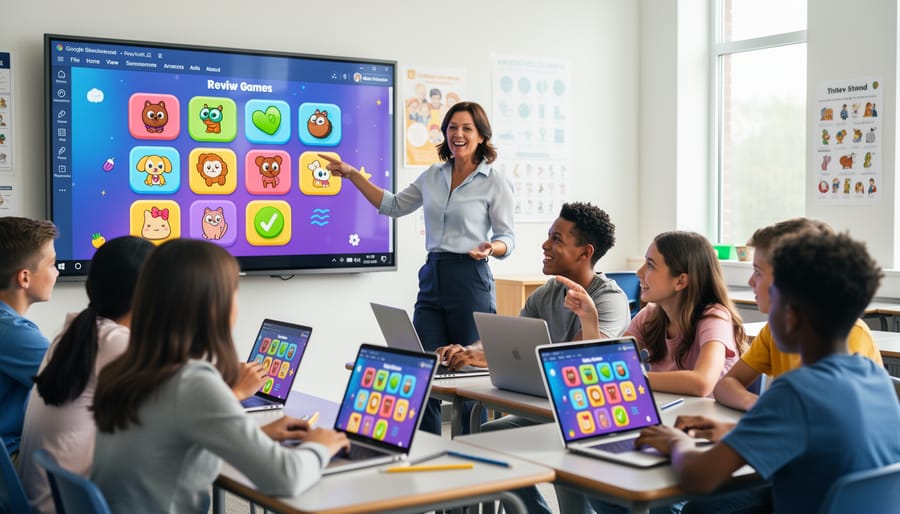
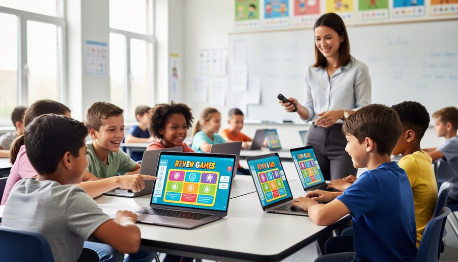
The best part? Good design actually helps learning happen. Clear visual hierarchy guides students to the most important information first. Consistent color coding helps them recognize patterns and remember content. Strategic use of images reinforces concepts in ways that stick long after the game ends.
You don’t need to be a graphic designer to make this work. Small improvements like choosing readable fonts, using contrasting colors, and leaving breathing room around text can transform your classroom games from “meh” to “can we play again?” Understanding these basics means you’re not just entertaining students, you’re creating an environment where they want to learn.
Where to Find Design Ideas That Work for Teachers
TV Game Shows: Proven Formats Students Already Love
Students light up when they recognize familiar game show formats—it’s instant engagement you can harness! Classic shows like Jeopardy, Wheel of Fortune, and Family Feud have stood the test of time because their structures just work. The beauty is that these formats translate perfectly into PowerPoint templates you can customize for any subject.
Modern hits like The Price Is Right or Who Wants to Be a Millionaire offer fresh alternatives that keep things exciting. These shows already have built-in suspense, clear rules, and visual elements students recognize immediately. No need to explain how the game works—they already know!
The best part? These proven formats give you a solid framework to build on. Start with the basic structure, then make it your own by adding your class content, changing colors to match your theme, or adjusting point values. You’re not creating from scratch—you’re adapting something that already captures attention. Whether you’re reviewing multiplication facts or vocabulary words, these familiar formats transform routine review into something students actually look forward to. Plus, the competitive element naturally motivates participation without feeling forced.
Student-Friendly Visual Themes
Choosing the right visual theme makes all the difference in keeping your students engaged! For elementary learners, think bright, playful designs with cartoon characters, bold colors, and fun shapes. These younger students respond wonderfully to themes featuring animals, space adventures, or treasure hunts that spark their imagination.
Middle schoolers appreciate slightly more sophisticated designs that still feel energetic. Try themes with cool graphics, game-show styles, or adventure quests that mirror popular video games they know. These students want to feel grown-up but still enjoy colorful, dynamic presentations.
High school students prefer cleaner, more modern aesthetics. Think escape room vibes, mystery themes, or competition-style layouts with sleek fonts and strategic pops of color. They’ll engage more when designs feel mature yet interactive.
Remember, the best theme connects to your lesson content while matching your students’ interests. A history lesson might use a time-travel theme, while math could feature a sports tournament design. Test different styles with your class and notice what gets them excited. You can always customize templates to fit your unique classroom personality and learning objectives!
Seasonal and Subject-Specific Inspiration
Boost engagement by matching your PowerPoint games to what’s happening in your classroom calendar! Seasonal themes instantly grab student attention. Try autumn leaves and warm colors for fall review games, snowflakes and cool blues for winter trivia, or bright florals for spring assessments. Holiday-themed templates make learning feel like celebration rather than work.
Subject-specific designs work wonders too. Use test tubes and atom graphics for science games, historical maps for social studies, or musical notes for language arts activities. The key is choosing imagery your students already associate with the topic. This creates instant recognition and excitement before they even start playing.
Don’t overthink it – even simple themed backgrounds with relevant clip art can transform a basic quiz into something special. Your students will notice the extra effort, and that enthusiasm translates directly into participation and learning outcomes.
Design Elements That Make PowerPoint Games Pop
Color Schemes That Energize Without Overwhelming
Great news! You don’t need to be a color expert to create PowerPoint slides that grab your students’ attention without giving them a headache. Start with the 60-30-10 rule: use your main color for about 60% of the slide, a complementary color for 30%, and a bold accent color for just 10%. This keeps things visually interesting without turning into a rainbow explosion.
Stick to three colors maximum per slide. Think of popular games your students love—they use limited, high-contrast palettes that are easy on the eyes. Try pairing a calm background color like navy blue or forest green with a neutral like cream, then add pops of yellow or orange for important game elements like point values or buttons.
Want instant energy? Use complementary colors (opposites on the color wheel) like purple and yellow, but keep one lighter than the other to maintain readability. Avoid red text on green backgrounds or vice versa—these combinations make reading tough for many students.
Test your color scheme by stepping back from your screen. Can you still read everything clearly? If your text blends into the background or makes your eyes work too hard, adjust the contrast. Remember, exciting doesn’t mean chaotic—your game should energize learning, not distract from it!
Typography Tricks for Maximum Readability
Your students can’t engage with content they can’t read! Start with bold, sans-serif fonts like Arial, Calibri, or Verdana—they’re clean and visible from the back row. Keep your font size at minimum 28pt for body text and 44pt or larger for titles. This makes your Q&A slides accessible to everyone.
Use high contrast combinations: dark text on light backgrounds works best (think black on white or navy on cream). Avoid red-green pairings since some students have color vision differences. Limit yourself to two fonts maximum per presentation—one for headings, one for body text.
Here’s a quick win: increase line spacing to 1.5 for easier reading. And remember, if you need to shrink text to fit, you’ve got too much content on that slide! Break it into multiple slides instead. Your students will thank you for keeping things crisp and readable.
Strategic Use of Graphics and Icons
Graphics and icons are your secret weapons for creating engaging game templates that students will love! The key is choosing visuals that support learning without overwhelming the screen. Start by selecting icons that clearly represent your content – think lightbulbs for ideas, stars for correct answers, or treasure chests for bonus points. Keep your color palette simple, using 2-3 main colors that complement each other and maintain readability.
Size matters too! Make important icons prominent while keeping decorative elements smaller. This helps direct student attention where you want it. Spacing is equally crucial – give your graphics room to breathe by leaving adequate white space around them. This prevents that cluttered, chaotic look that can distract learners.
Here’s a fun tip: use consistent icon styles throughout your presentation. Mixing cartoon-style graphics with realistic photos creates visual confusion. Stick with one style for a polished, professional appearance that keeps students focused on learning rather than visual inconsistencies. Remember, every graphic should serve a purpose – if it doesn’t enhance understanding or engagement, leave it out!
Sound Effects and Animation Timing
Sound effects can transform your game from good to amazing! A cheerful “ding” when students answer correctly or a playful buzzer for wrong answers adds instant feedback that keeps energy high. The key is choosing sounds that enhance rather than distract – think quick, upbeat audio clips under two seconds.
Animation timing matters just as much. Set your correct answer celebrations to appear immediately (0.5 seconds) so students connect their choice to the reward. For revealing new questions, use a one-second delay to build that game show suspense. PowerPoint’s animation pane lets you customize these timings easily – just right-click any element and select “Animation Pane.”
Keep it simple and purposeful. Too many whooshes and spins can overwhelm students, especially younger learners. Instead, reserve your most exciting effects for big moments like bonus rounds or final scores. Your students will stay focused on learning while enjoying that extra spark of fun!
Customization: Making Templates Your Own
Quick Tweaks for Big Impact
You don’t need to be a design pro to make your PowerPoint games pop! Start by swapping out default fonts for something more playful—think rounded fonts for younger students or bold sans-serif options for older grades. This single change instantly modernizes your presentation.
Next, add your students’ interests! Drop in themed clipart or photos that connect to their favorite topics. Teaching fractions? Use pizza slices. Reviewing vocabulary? Add superhero characters. These small touches show you’re thinking about what excites them.
Color coordination makes everything look polished without extra effort. Pick three colors that complement each other and use them consistently throughout your game. Most templates already have color schemes—just click to swap them!
Finally, personalize transition effects between slides to build anticipation. A simple “swoosh” or “fade” between questions keeps energy high without being distracting. Remember, even five minutes of tweaking can transform a basic template into something that feels uniquely yours and captures your students’ attention from the first slide.
Adapting Designs for Different Grade Levels
Your game presentations need to match your students’ developmental stages to really capture their attention! For elementary students, go big and bold with bright colors, playful fonts, and simple layouts. Think cartoon-style characters, large easy-to-read text, and plenty of fun animations that keep little ones excited. Use visual cues like arrows and stars to guide them through the game.
As you move to middle school, you can introduce more sophisticated color schemes and slightly more complex layouts. Try incorporating popular culture references they love, modern graphics, and a bit more text on each slide. These students appreciate designs that feel less childish but still maintain that game-show energy.
High schoolers respond well to sleek, professional-looking templates with subtle animations. Consider designs inspired by actual game shows, trivia apps, or social media aesthetics they recognize. You can use more detailed information per slide and incorporate competitive elements through progress bars and scoreboards.
The key is making your presentations accessible for every student while matching their maturity level. Don’t be afraid to ask your students what design styles they find most engaging—they’ll appreciate having input, and you’ll get valuable insights for future presentations!
Real Classroom Success Stories
Real teachers have seen amazing transformations in their classrooms after upgrading their PowerPoint game designs. Mrs. Chen, a 5th-grade teacher from Oregon, redesigned her vocabulary review game with bright colors and custom graphics instead of plain text slides. She noticed immediate changes: students who typically zoned out during review were raising their hands eagerly, and participation jumped from about 60% to nearly 100%.
A middle school science teacher in Texas created a jeopardy-style game using themed backgrounds matching each unit. For the space unit, he added galaxy images and astronaut graphics. Students started asking when the next game day would be, and quiz scores improved by an average of 15% compared to traditional review methods.
Even simple changes make a difference. A 2nd-grade teacher replaced her basic multiplication game with one featuring fun animal characters and colorful point counters. Her struggling learners became more confident because the playful design reduced test anxiety and made practice feel like playtime.
The common thread? These educators didn’t need professional design skills. They used templates, added relevant images, and chose cohesive color schemes. The investment of 30-45 minutes in thoughtful design paid off with weeks of enthusiastic student engagement. Your review sessions can experience the same boost when you prioritize visual appeal alongside educational content.
You’ve got this! The world of PowerPoint design is more accessible than ever, and even small visual tweaks can transform your classroom engagement. Don’t feel pressured to become a professional designer overnight. Start with one template that excites you, adjust a few colors to match your teaching style, and watch how your students respond. Remember, great design isn’t about perfection—it’s about creating an inviting, clear space where learning feels fun and interactive. With so many ready-made templates available, you can focus your energy on what you do best: teaching. Try experimenting with just one design element this week, whether it’s a fresh color scheme or an engaging game layout. Your students will notice the difference, and you’ll discover that creating visually appealing presentations doesn’t have to eat into your precious planning time. Every small improvement counts, and your creativity deserves a chance to shine in the classroom!