
How to Build a 2 Content Layout in PowerPoint That Adapts to Any Screen
A 2 content layout in PowerPoint splits your slide into two equal placeholders, side by side, so you can pair a list with a picture, a question with its answer, or two ideas you want students to compare. You can pick it from the Layout menu in about 30 seconds, and customizing it to fit your lesson takes only a few minutes more. No design skills required.
Why does this layout earn its spot in so many classrooms? It gives your slides a clear left side and right side, which keeps students’ eyes (and attention) organized. Think vocabulary words next to images, “before and after” science observations, or a character comparison in a novel study. It’s also a great base for review games, where one side shows the clue and the other hides the reveal.
The catch is that a layout that looks perfect on your laptop can get squished on a projector or a student tablet. That’s where adaptive template design comes in, helping your two content boxes stay balanced no matter what screen they land on.
Ready to build one that’s truly yours? Let’s gather what you need and get started.
What You’ll Need Before You Start (Tools and Materials)

Before you dive in, let’s get everything in one place. The good news? You probably have it all already, and nothing here costs a thing.
Here’s your quick checklist:
- PowerPoint (any recent version works, including the one on your school laptop)
- A blank presentation or an existing game template you’d like to tweak
- Your content, like review questions, images, and team names
- A rough sketch of your layout on scrap paper or a sticky note
- About 15 minutes of uninterrupted time
A few quick notes on those items. If you’re starting from a blank presentation, that’s perfectly fine. You’ll be building the layout from scratch, so there’s nothing to untangle. If you’d rather start from a game template, grab a copy first so your original stays safe.
Don’t skip the sketch! It sounds old-school, but a two-minute doodle of where the question goes and where the answers or scoreboard will live saves you a lot of dragging and resizing later. Stick figures and rectangles are totally acceptable.
It also helps to have a few real examples ready, like a sample question and two or three images. When you test your layout, you’ll see right away whether it works for your actual lessons instead of placeholder text.
Got your list covered? Then you’re ready to roll.
Why Two Content Placeholders Are a Classroom Game Changer
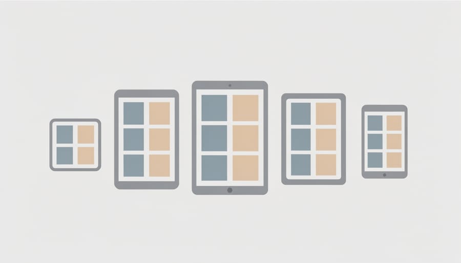
A 2 content layout is simply a slide with two side-by-side boxes, called placeholders, where you drop in text, pictures, or both. That tiny change does a lot of heavy lifting in a classroom. Instead of cramming everything into one big box, you get two clear zones that tell students exactly where to look.
Think about how many of your favorite activities are really “this and that.” A review game puts the question on the left and the answer choices on the right. Vocabulary matching pairs a picture with its word. Compare-and-contrast slides set two ideas next to each other so students can spot the differences at a glance. Even a quick icebreaker like “this or that” works beautifully when each option gets its own side of the screen.
Here’s where the adaptive idea comes in. If you build the layout once in Slide Master, every new slide you add inherits it automatically. The placeholders already know their size and position, so you’re not nudging boxes around slide after slide. And because they’re anchored to the slide itself, they resize gracefully when you move between a widescreen monitor and an older projector.
That means less fiddling and more time planning the fun part. You set it up one time, and your students get a clean, consistent look every time you play.
Before You Build: Protect Your Work and Avoid Common Slip-Ups (Safety Warnings)
A little prep now will save you a lot of frustration later. Here are the slip-ups teachers run into most often, and how to dodge them.
First, the master mix-up. Many decks carry more than one slide master, and it’s easy to tweak the wrong one. If your changes seem to vanish or show up in the wrong place, this is usually why. Click the master thumbnail at the very top of the left panel and look at its name before you build.
Second, overwriting a favorite. If you’re starting from a game template you love, use Save As right away and give your version a new name. That way the original stays safe in case you ever want a fresh start.
Third, resist the urge to delete placeholders you don’t need. Other layouts may rely on them, and removing the wrong one can leave blank or oddly shaped slides. If something isn’t useful, hide it or leave it alone instead.
Last, pick your slide size before you add any content. Switching between 16:9 and 4:3 after you’ve placed text and images can stretch or squash everything, and you’ll end up nudging each slide back into shape by hand.
Step-by-Step: Creating Your Own Adaptive 2 Content Layout
Setting Up Your Slide Master
Let’s start by opening the control room where all your layouts live. Click the View tab, then choose Slide Master. Your screen will change, and you’ll see a big slide at the top of the left-hand list with a column of smaller layouts beneath it.
That top slide is the master. Anything you change there ripples down to every layout below it, so unless you want every slide in your deck to change, leave it alone for now. Work on the smaller layouts instead.
If your file has more than one master, look for the one that matches your deck’s theme and hover over it to check its name. Pick the one you’re actually using.
Now, rather than editing an existing layout, right-click the master and choose Insert Layout. You’ll get a fresh, blank layout to play with, and the rest of your template stays untouched. Give it a friendly name, like “Two Content Game,” so you can spot it later.
Sizing and Aligning the Two Placeholders
Once your new layout is open in Slide Master, it’s time to make both sides line up. Start by turning on your guides: right-click the slide background, choose Grid and Guides, and check Display Drawing Guides and Display Smart Guides. A center vertical guide is a lifesaver here, and you’ll also want a margin guide on the left and right so your content never crowds the edge.
Now click your first placeholder and drag it to the left half. Hold Shift while resizing to keep things neat. For the second placeholder, copy the first one’s size instead of eyeballing it: go to Shape Format and type the exact width and height in the Size boxes. Same numbers, same look. It sounds fussy, but it saves you from that one slightly crooked box that bugs you all semester.
Next, select both placeholders and open Align on the Shape Format tab. Choose Align Top so they sit at the same height, then Distribute Horizontally to even out the gap between them. A gap of about half an inch usually looks clean.
Which split should you use? Equal columns are perfect for matching games and compare-and-contrast slides. Try a 60/40 split when you want a longer question on the left and a picture or scoreboard on the right. Make the wider placeholder about 60 percent of your usable width, and the narrower one gets the rest.
Here’s the best part: placeholders hold their size no matter what your students’ answers look like. When you paste in a long question or a big photo, the box stays put, and text shrinks to fit instead of pushing everything around.
Making It Adapt: Slide Size and Screen Shape Tips
Not sure which shape your classroom screen is? Start with 16:9. Most modern projectors, smart boards, and laptops use it, and it gives you plenty of room for two side-by-side placeholders. Choose 4:3 only if you’re stuck with an older projector that squares off the picture.
To set it, head to the Design tab, click Slide Size, and pick Standard (4:3) or Widescreen (16:9). Do this before you add questions, images, or game pieces. That way your layout is built for the right shape from the start.
Switching later is possible, but it can get messy. PowerPoint will ask whether to Maximize or Ensure Fit. Maximize keeps your content big but can push things off the edge. Ensure Fit shrinks everything so it stays on the slide, which can leave smaller text and extra empty space. Because your placeholders live in Slide Master, they usually stretch and shift on their own, but pictures and text boxes you dropped in by hand might not follow along.
Here’s a quick way to check that nothing gets cut off:
1. Add a long question and a few answer choices to your test slide.
2. Look for text or pictures touching the slide edge.
3. Press F5 to view it in Slide Show mode.
4. Step back from your screen to see if the text still reads clearly from the back row.
If something looks cramped, nudge the placeholder a little smaller and try again.
Fun Ways to Use Your New 2 Content Layout in the Classroom
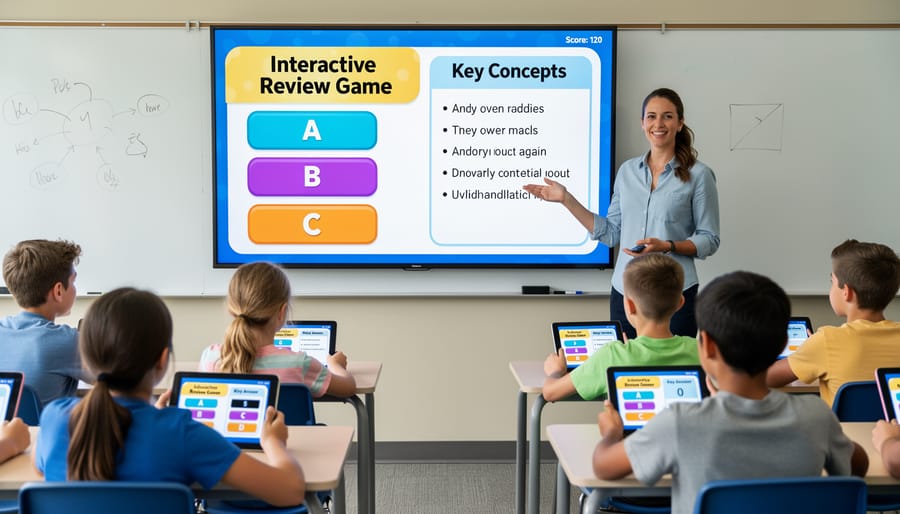
Once your two placeholders are set, the fun part begins. Here are a few ways to put that layout to work:
- Question and answer choices: Put the prompt on the left and the multiple-choice options on the right.
- Picture-and-word matching: Drop an image on one side and the vocabulary word on the other, then let students call out the match.
- Team scoreboards: Keep the question front and center while a simple score tracker sits beside it.
- This-or-that icebreakers: Show two choices side by side and have students move to one corner of the room to vote.
- Compare and contrast: Line up two characters, time periods, or science concepts so differences jump right off the screen.
- Before and after: Show a messy sentence on one side and the corrected version on the other.
Here’s where customizing really pays off. Swap in your school colors, pick a font your youngest readers can scan quickly, and add images that fit your lesson. If you want a head start on color and font combos, take a look at these PowerPoint design themes built with classroom games in mind.
Since the right side often holds your answer choices, it helps to keep the text short and spaced out so every student can read it from the back row. These Q&A slides tips are a great place to start.
Try one idea this week and see how your class responds. Chances are, they’ll be asking for the next round before you’ve even clicked to the next slide.
Check Your Layout and Plan Your Next Moves (Verification and Next Steps)
You’ve built it, so now let’s make sure it holds up. Start by adding test content: drop in a long question on the left and a few short answer choices on the right. Then press F5 for Slide Show mode and look for cut-off text or lopsided columns. Flip over to Reading view and presenter view too, since both can show spacing quirks. If you can, try it on a different screen, like a classroom projector or a colleague’s laptop. Finally, add a brand-new slide using your layout to confirm it inherits everything.
Not sure what to build next? Browsing a few layout examples can spark ideas for a 3-column or 1-content variation. Save your file as a template (.potx) so the original stays safe.
Why does my text jump around?
Usually the placeholder is set to auto-fit or the text box is slightly different in size from its neighbor. Fix the size in Slide Master and the shifting stops.
Can I use this layout in Google Slides?
Yes. Google Slides has its own Theme builder, so you’ll recreate the two placeholders there, but the sizing ideas carry over.
What if my projector is 4:3?
Switch the slide size to 4:3 in Design, then recheck your columns for crowding. It’s a quick fix if you test before adding lots of content.
How do I add this layout to an existing template?
Open the existing template’s Slide Master, then paste in a copy of your layout slide. Use “Keep Source Formatting” if you want to hold onto your design.
When you’re ready to skip the building, a ready-made game template can save you a whole prep period.
You’ve got everything you need to build a layout that fits your classroom, so go ahead and play with it. Nudge a placeholder, try a 60/40 split, swap in your school colors, and see what feels right for your students. Every tweak you make teaches you something, and the layout only has to work for you.
Once your two-column slides are humming, think about how much livelier review time can feel. A question on one side and answer choices on the other is the start of a real game. If you’d like a head start, browse our customizable game templates with built-in scoreboards and sound effects, then make them your own. Your students will love it.