These Google Slide Layout Ideas Will Transform Your Classroom Game Templates
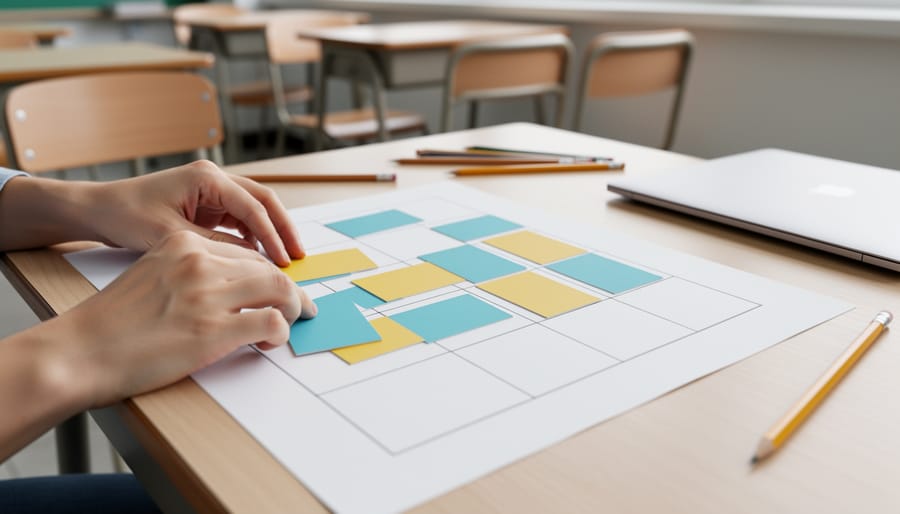
Start with a clear grid system that divides your slide into equal sections—thirds, quarters, or columns—to create visual balance and make content scannable at a glance. This foundational structure works beautifully for classroom game templates because students can quickly identify where to look for questions, answers, or point values.
Layer visual hierarchy by varying text sizes strategically: use large, bold headers for game titles or categories, medium-sized text for questions or instructions, and smaller text for additional details. This three-tier approach helps students of all ages navigate your activities without confusion, whether you’re designing a Jeopardy-style quiz or a collaborative team challenge.
Incorporate designated “action zones” on each slide—specific areas where interactive elements like clickable buttons, answer reveals, or score trackers consistently appear. When students know exactly where to expect these features across multiple slides, they spend less time figuring out mechanics and more time learning.
Choose asymmetrical layouts for dynamic energy by placing your main content slightly off-center, then balance it with complementary elements like images, icons, or text boxes on the opposite side. This design technique transforms standard quiz slides into visually engaging experiences that capture attention while maintaining the flexibility to adapt content across different subjects and grade levels. The key is creating templates you can customize quickly without starting from scratch each time.
Why Google Slide Layout Thinking Makes Better PowerPoint Templates
Here’s what makes Google Slides’ approach so brilliant for creating game templates: flexibility is built right into the design philosophy. Unlike traditional PowerPoint templates that can feel rigid and locked into one specific format, Google Slides encourages adaptable layouts that breathe and adjust as your content changes.
Think about it this way. When you’re designing classroom games, you never know exactly what you’ll need next week. Today it’s vocabulary review, tomorrow it’s math practice, and next month you’re doing a history quiz. Google’s layout thinking embraces this reality by prioritizing simple, modular designs that work across different subjects and activities.
The secret lies in creating interactive slide decks with consistent structure but flexible content areas. Rather than designing a template specifically for spelling bees or trivia games, you’re building a framework that adapts beautifully to whatever you throw at it.
This approach saves you serious time. Instead of hunting for a new template every time you switch topics, you’ve got one versatile design that handles everything. Change the colors for different subjects, swap out the questions, adjust the point values, and you’re ready to go.
The best part? Your students benefit too. When game layouts stay familiar, kids spend less time figuring out the format and more time actually learning. They recognize the structure immediately and dive right into the content. That’s the magic of borrowing Google’s flexible layout philosophy for your PowerPoint game templates.
The Foundation: Creating Flexible Content Zones
Question and Answer Areas That Breathe
Here’s the thing about classroom games: you never know if you’ll need space for a quick three-word answer or a full paragraph response. That’s why your Q&A slide design needs to be flexible enough to handle both without looking cramped or empty.
Start by creating text boxes with generous padding around all sides. Think of it like giving your content room to breathe. A good rule of thumb is leaving at least 0.5 inches of space from the edges. This prevents text from feeling squished against borders and makes everything easier to read from the back of the classroom.
Use text boxes that can expand vertically but stay anchored horizontally. Set your question area to a consistent width, but let the height adjust based on content length. This way, whether you’re displaying “What is 2+2?” or a three-sentence word problem, your layout stays balanced.
Consider designing two or three content area variations within the same template. Create one optimized for short questions, another for medium-length passages, and a third for longer reading comprehension exercises. You can simply duplicate slides and adjust text box sizes while keeping colors, fonts, and other design elements consistent.
Don’t forget about answer spaces! Design them to accommodate single words, multiple choice options, or full sentences. Placeholder text like “Type answer here” helps students know exactly where to focus.
Scoreboard Sections That Stay Put
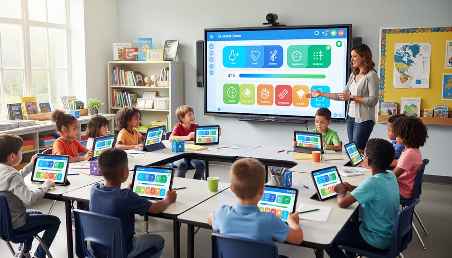
Want to create game slides where your scoreboard and navigation buttons stay exactly where you put them? Think of these elements as the anchors of your classroom game – they should remain consistent so students always know where to look!
Start by creating a master template slide with your fixed elements. Place your team score boxes in the same corner on every slide – top right works great! Add navigation buttons like “Home,” “Next Question,” or “Back to Board” in consistent spots. When these elements live in the same location throughout your game, students won’t waste time searching for information.
Here’s a game-changing trick: group your scoreboard elements together before copying them to new slides. Select all your score boxes, team names, and any decorative borders, then right-click and choose “Group.” Now you can copy this entire unit to each slide without anything shifting out of place. It’s like having a permanent fixture that travels with you!
For navigation buttons, create a simple system using shapes with hyperlinks. Make buttons the same size and color throughout your presentation, positioning them in a horizontal row at the bottom or vertically along one side. Consistency is key – when students see that green home button in the bottom left corner on slide 5, they should find it in the exact same spot on slide 25.
Remember to test your navigation before game day! Click through your entire presentation to ensure everything stays put and works smoothly. Your future self will thank you when class runs seamlessly!
Smart Layout Ideas You Can Steal from Google Slides
The Split-Screen Layout for Team Competitions
Team competitions bring incredible energy to your classroom, and a split-screen layout is your secret weapon for keeping things fair and exciting! This design divides your slide vertically down the middle, giving each team equal visual space.
Start by inserting a rectangle that covers exactly half your slide. Duplicate it for the opposite side, then assign each team a distinct background color. This creates instant visual separation that students can easily follow during fast-paced games. Pro tip: use your school colors or let students vote on their team’s color scheme for extra buy-in!
Add matching text boxes, score counters, or image placeholders to each side. The key is maintaining symmetry so neither team feels shortchanged. Think mirror images with different content. You can customize these templates by adding team name spaces, point trackers, or even small mascot images.
This layout works beautifully for review games, debate formats, or any head-to-head challenge. The balanced design keeps everyone engaged because both teams have equal visibility on screen. Plus, students love seeing their side of the board fill up with points or achievements throughout the game!
The Card-Based Grid for Multiple Choice Magic
Transform your multiple choice questions into an engaging visual experience with card-based grids! This layout adapts beautifully to different question types – use a simple 2×2 grid for younger students or questions with fewer options, then scale up to 3×3 or even 4×4 grids when you need more answer choices.
Here’s the magic: design each answer option as a clickable card with distinct colors or icons. Students love the game-show feel! Start by creating uniform rectangles with rounded corners, then add your answer text in large, readable fonts. Space them evenly across your slide, leaving breathing room between cards so little fingers can click accurately on touchscreens.
The beauty of this system is its flexibility. Teaching multiplication? A 2×2 grid works perfectly. Reviewing vocabulary with six options? Switch to a 3×2 layout in seconds. Need to challenge older students with eight possibilities? Go for that 4×2 arrangement!
Pro tip: use consistent card sizes within each game to keep things visually clean, but don’t be afraid to adjust the grid layout between different activities. Color-code cards by difficulty level or subject area to help students navigate quickly. This responsive approach keeps your presentations fresh while maintaining that professional, organized look your students respond to best.
The Spotlight Layout for Individual Challenges
Want to create that “all eyes on this” moment in your classroom? The spotlight layout is your best friend! This design puts one central element front and center—think of it like turning on a stage spotlight where everything else fades into the background.
Here’s the magic formula: Place your main question, image, or challenge directly in the middle of the slide, making it at least twice the size of any other element. Use a simple, clean background (solid colors work beautifully!) and minimal text around the edges. This works wonders for think-pair-share activities where students need to focus on a single prompt before discussing with partners.
Try creating a large circular or rectangular frame in the center for your spotlight content. You can customize the colors to match your subject—bright blue for science questions, warm yellow for morning challenges, or even theme it to your current unit! Add just a small heading at the top and instructions at the bottom in smaller font.
This layout shines during class discussions because students aren’t overwhelmed by competing visual elements. They know exactly where to look and what matters most. Plus, you can easily swap out the center content for different subjects while keeping the same template structure!
The Timeline Layout for Sequential Games
Sequential games like trivia tournaments, scavenger hunts, and vocabulary challenges work brilliantly with timeline layouts! Think of your slide as a visual path that students follow from start to finish.
For horizontal timelines, arrange numbered circles or shapes across your slide from left to right. Each station represents a question, clue, or challenge. Students literally see their progress as they move along the path, which builds excitement and motivation. Add arrows between stations to reinforce the forward momentum, and consider using color gradients that shift from cool to warm tones as students advance.
Vertical timelines work great for ladder-style games or climbing challenges. Stack your elements from bottom to top, creating that satisfying upward journey toward success. This layout is perfect for review games where students climb higher with each correct answer.
Here’s the fun part: make your timeline interactive by revealing answers or next steps progressively. Use animations to unveil each station only after students complete the previous one. You can also customize the theme to match your content, like a treasure map for history lessons or a rocket launch for science units. This keeps everyone engaged and creates natural checkpoints throughout your activity.
Making Your Templates Work Across Subjects and Grade Levels
The secret to creating truly versatile templates? Think neutral and flexible from the start! When you’re designing your master layout, choose design elements that won’t box you into just one subject area. Instead of math-specific graphics or reading-themed borders, opt for geometric shapes, clean lines, and adaptable color zones that work beautifully whether you’re teaching multiplication or life cycles.
Start by creating designated “swap zones” in your template. These are specific areas where you can easily drop in subject-specific content without disrupting the overall design. For example, a game board template might have circular spaces that could hold math problems on Monday, vocabulary words on Wednesday, and science questions on Friday. The layout stays consistent, but the content changes in minutes.
Color-coding is your best friend here! Assign different colored text boxes or backgrounds that you can quickly modify. A blue text box might signal math content this week, but switch it to green next week for science. This visual consistency helps students recognize the game format while keeping content fresh across subjects.
Keep your fonts simple and readable. Stick with two complementary fonts maximum – one for headings and one for content. This creates visual harmony whether you’re displaying fractions or historical facts. Similarly, maintain consistent spacing and sizing for text boxes so switching between a spelling word and a math equation requires minimal adjustment.
Pro tip: Create a simple color palette guide right on your template’s last slide. Include 4-5 versatile colors and note which subjects they represent. This makes customization super quick and keeps your materials looking cohesive throughout the year!
Quick Customization Tricks That Save Teachers Time
Customizing your Google Slide layouts doesn’t have to eat up your precious planning time! Here are some game-changing shortcuts that’ll have you creating fresh, personalized templates in minutes.
Start with the master slide feature. Click View, then Master, and make your color changes there. When you update colors in the master slide, every slide in your presentation updates automatically. No more clicking through dozens of slides one by one! This works beautifully with design themes you’ve already created.
For quick font swaps, use the Replace Fonts feature under the Edit menu. Select your current font and the new one you want, and boom—everything changes instantly across your entire presentation. This keeps your text consistent and saves tons of clicking.
Want to swap images without messing up your layout? Right-click any image and choose Replace Image. Your new picture will pop into the exact same spot and size as the original. Perfect for updating seasonal content or switching between subjects!
Create a color palette slide at the beginning of your template with your go-to colors. Copy and paste these color swatches whenever you need them, ensuring consistency without hunting through menus.
Finally, duplicate slides that work well rather than starting from scratch. Once you’ve nailed a layout you love, copy it and just swap the content. You’ll maintain that polished look while saving yourself from reinventing the wheel every single time.

Ready to transform your classroom games? Now’s the perfect time to put these layout ideas into action! Start by choosing one game template you already use and experiment with applying these Google Slide-inspired principles. Try adding flexible text boxes, swapping in different subject content, or reorganizing elements to better fit your teaching flow. The beauty of these adaptive layouts is that they grow with you—once you create a solid foundation, you can remix and reuse it across units, subjects, and grade levels.
Remember, there’s no one-size-fits-all approach here. Your classroom is unique, and your game templates should reflect that. Maybe your students love visual cues, or perhaps they respond better to minimal designs. Test different layouts, ask for student feedback, and adjust as you go. The more you play with these customizable frameworks, the more confident you’ll become at designing interactive tools that truly click with your learners. So grab that PowerPoint template and start experimenting—your next amazing classroom game is just a few layout tweaks away!