Why Accessible Design Certification Matters for Your Digital Classroom
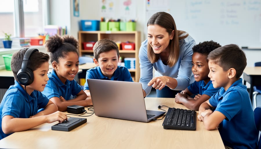
Accessible design certification ensures your digital classroom tools work for every student, including those with visual, hearing, motor, or cognitive differences. When a platform or resource carries accessibility certification like WCAG 2.1 AA or Section 508 compliance, it means the tool has been evaluated against specific standards that make content perceivable, operable, and understandable for all learners.
For teachers, this certification matters because it removes barriers before they affect your students. Certified tools include features like screen reader compatibility, keyboard navigation, adjustable text sizes, and color contrast that supports students with low vision. You’re not just meeting legal requirements—you’re creating an inclusive learning environment where every student can participate fully in your review games, quizzes, and interactive activities.
Look for accessibility statements on your favorite platforms, typically found in footer links or help sections. These statements reveal which standards the tool meets and outline specific features available. When choosing new classroom technology, prioritize certified options to save time adapting materials later. If your current tools lack certification, simple modifications like adding alt text to images, using clear headings, and ensuring color isn’t the only way to convey information can dramatically improve accessibility for your students.
What Is Accessible Design Certification?
The Basics Every Teacher Should Know
Let’s break down accessibility standards in a way that makes sense for your classroom! Think of accessible design certification as a “stamp of approval” that tells you a digital tool works for all learners, including students with disabilities.
The main guideline you’ll hear about is WCAG (Web Content Accessibility Guidelines). Don’t worry about memorizing the acronym—just know it’s the gold standard that ensures websites and apps are usable by everyone. Here’s what it means in practical terms:
Can all students see and understand the content? This includes having good color contrast, text that can be enlarged, and captions for videos.
Can students navigate using different methods? Some learners use keyboards instead of a mouse, screen readers that speak text aloud, or voice commands.
Is the content clear and predictable? Buttons should do what students expect, instructions should be straightforward, and layouts should stay consistent.
When a tool has accessibility certification, it means developers have tested these elements and made adjustments so your whole class can participate. Think of it as ensuring every student has a fair shot at engaging with your review games and activities, regardless of how they learn best. It’s really about removing barriers before they impact your students!
Who Benefits From Certified Accessible Tools?
Certified accessible tools create inclusive classrooms where every student can participate fully and confidently. Students with visual differences benefit from screen reader compatibility and adjustable text sizes, while learners with hearing differences gain from captions and visual alternatives to audio content. For students with motor challenges, keyboard navigation and touch-friendly interfaces make interaction easier. Those with cognitive differences appreciate clear layouts, consistent navigation, and customizable pacing that supports their learning style.
Here’s the exciting part: accessibility features help everyone! Captions assist students learning English as a second language and those in noisy environments. Keyboard shortcuts speed up navigation for all users. Clear visual design reduces cognitive load, helping students focus on learning rather than figuring out how to use the tool. When you choose certified accessible platforms, you’re creating personalized learning experiences that adapt to individual needs.
By prioritizing accessibility certification, you’re ensuring no student sits on the sidelines during engaging review games and activities. You’re building a classroom culture where different learning needs are expected and supported, not treated as exceptions. That’s true inclusive education in action.
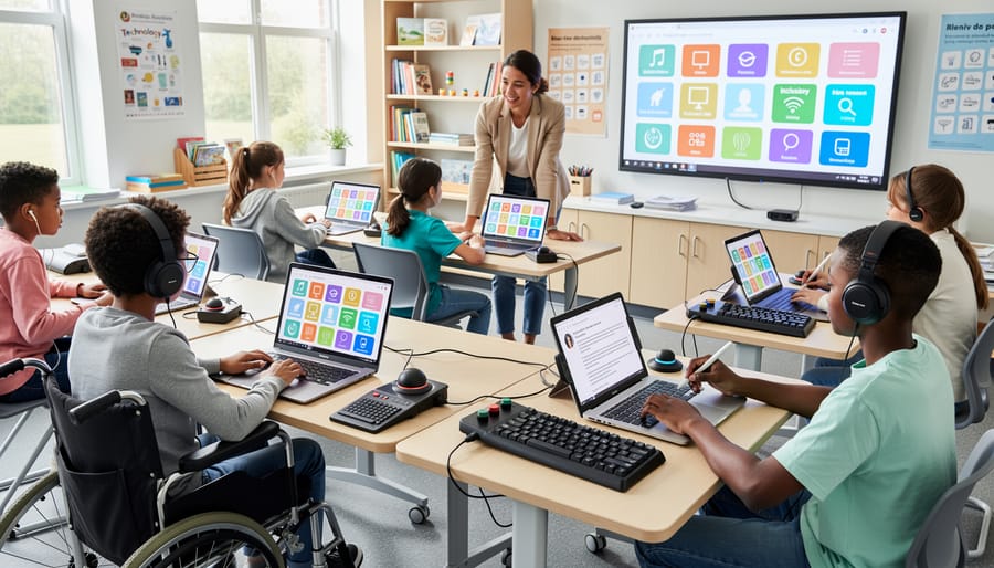
How Accessible Design Makes Your Review Games Work for Everyone
Screen Reader Compatibility
When you choose certified accessible game-based learning tools, you’re ensuring that students who use screen readers can jump right into the fun alongside their classmates. These tools are designed to work seamlessly with popular assistive technologies like JAWS, NVDA, and VoiceOver, giving every student equal access to interactive review games and activities.
Certified platforms include proper text alternatives for images, clear navigation that works with keyboard-only commands, and content that screen readers can interpret accurately. This means your visually impaired students can hear game questions, select answers, and receive instant feedback just like everyone else. The certification process tests these features extensively, so you don’t have to worry about technical compatibility issues interrupting your lesson flow.
What’s really exciting is how customizable these accessible tools are for your classroom needs. You can adjust question formats, modify time limits, and personalize game content while maintaining full screen reader compatibility. This gives you the flexibility to create engaging learning experiences that truly include all your students, turning review time into an opportunity for everyone to shine.
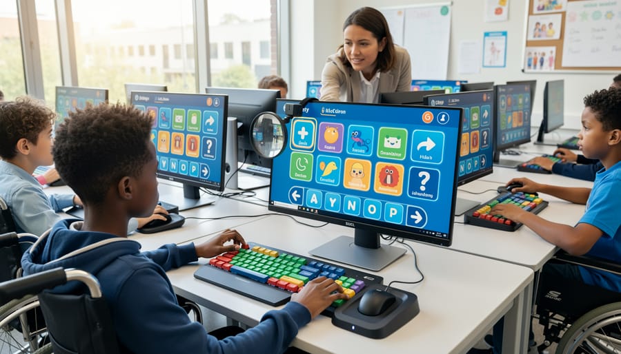
Color Contrast and Visual Clarity
Color makes all the difference in whether students can actually see and engage with your digital activities. Accessible design certification ensures that text stands out clearly from backgrounds, buttons are easy to spot, and game elements don’t blend together. Think high contrast combinations like dark text on light backgrounds rather than yellow text on white.
Here’s the exciting part: many certified accessible tools let you customize color schemes to match your students’ needs. Some learners might prefer softer tones to reduce eye strain, while others benefit from bolder contrasts. Look for platforms that offer color adjustment options or alternative visual modes.
Quick tip: test your game screens by viewing them in grayscale. If elements disappear or become hard to distinguish, the contrast needs boosting. Remember, about 1 in 12 boys and 1 in 200 girls have some form of color vision deficiency, so don’t rely on color alone to convey important information. Pair colors with icons, patterns, or text labels to ensure everyone can participate fully.
Keyboard Navigation and Motor Accessibility
Keyboard navigation is a game-changer for students who find precise mouse movements challenging. When digital tools are certified for accessibility, they support full keyboard control, meaning students can navigate menus, select answers, and interact with content using just the Tab key, arrow keys, and Enter key. This opens up participation for learners with motor disabilities, tremors, or coordination difficulties.
Think about review games in your classroom. Tools with keyboard shortcuts let every student join the fun without struggling with point-and-click actions. Students can press the spacebar to buzz in, use arrow keys to choose answers, or hit number keys to respond quickly during team competitions.
The best part? Keyboard accessibility benefits everyone. Some students simply prefer keyboard shortcuts because they’re faster, while others with temporary injuries like a broken arm can still participate fully. When choosing certified accessible tools, test the keyboard navigation yourself. Can you complete all activities without touching the mouse? If yes, you’ve found a winner that welcomes more learners into your interactive lessons.
Finding and Choosing Certified Accessible Resources
What to Look For in Product Descriptions
When you’re shopping for digital tools and educational resources, keep your eyes open for these accessibility indicators that show a product takes inclusive design seriously! First up, look for certification badges from recognized organizations like WCAG (Web Content Accessibility Guidelines) or Section 508 compliance stamps. These badges are usually displayed prominently on product pages or in the footer.
Check the product description for clear compliance statements that mention specific accessibility standards. Good tools will proudly highlight features like screen reader compatibility, keyboard navigation options, and adjustable text sizes right in their marketing materials.
Create your own quick mental checklist when browsing: Can students adjust colors and contrast? Does it offer text-to-speech or captions for audio content? Is there support for alternative input methods? Quality products will spell out these features clearly rather than hiding them in fine print.
Don’t hesitate to reach out to customer support if accessibility information isn’t obvious. Companies committed to inclusive design are usually happy to provide detailed documentation. Remember, the best educational tools make it easy for you to spot their accessibility features because they’re genuinely proud of making learning work for everyone in your classroom!
Questions to Ask Before You Buy
Before investing in new classroom technology, take a moment to ask these important questions. They’ll help you make confident choices that work for all your students!
Does this tool meet WCAG standards or have recognized accessibility certifications? Look for badges like VPAT compliance or references to WCAG 2.1 Level AA. These indicate the vendor has prioritized accessibility in their design.
Can students navigate without a mouse? Try using only your keyboard—if you can access all features with Tab, Enter, and arrow keys, students with motor challenges will have a better experience.
Will screen readers work with this tool? Ask vendors directly or test with free screen readers. Your visually impaired students need content that’s properly labeled and structured.
Are captions and transcripts available for audio and video content? This supports not just deaf and hard-of-hearing students, but also English language learners and anyone in noisy environments.
Can I customize colors, fonts, and text size? Students with dyslexia, low vision, or sensory sensitivities benefit from these adjustments.
Is there technical support for accessibility questions? When evaluating educational tools, responsive support makes a huge difference.
Does the pricing include accessibility features, or are they add-ons? All students deserve equal access without extra costs.
Remember, these questions aren’t just checkboxes—they’re about creating an inclusive learning environment where every student can participate fully and succeed!
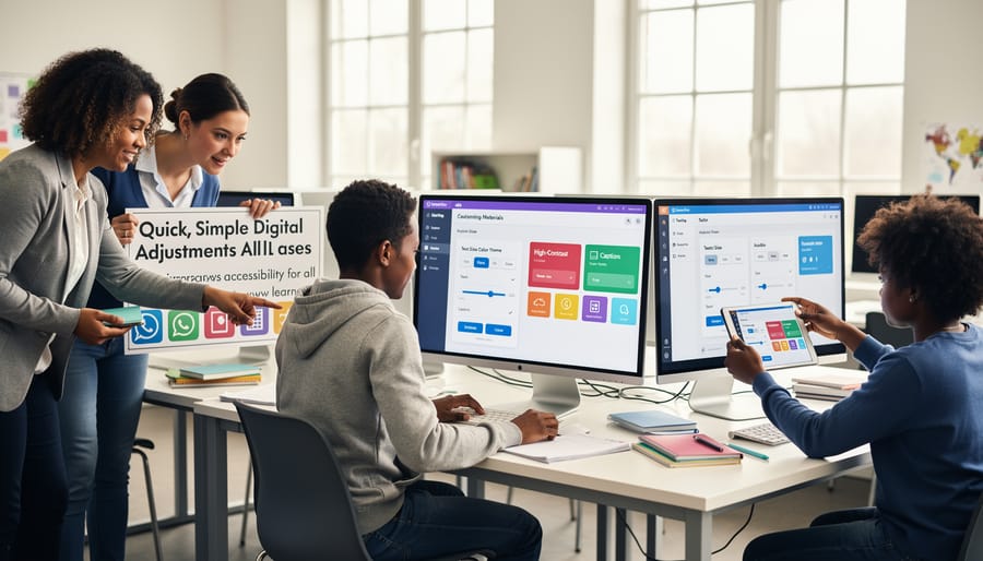
Making Your Current Classroom Tools More Accessible
Quick Customization Fixes
Good news! You don’t need to be a tech expert to make your digital materials more accessible. Here are three quick wins that take just minutes but create huge improvements for all your students:
Start with fonts. Switch to clean, readable options like Arial, Verdana, or Comic Sans. Bump up the size to at least 14-point, and avoid fancy scripts that look pretty but are tough to decode. This simple change helps students with dyslexia and visual processing differences.
Next, tackle contrast. Dark text on light backgrounds works best. Think black or navy on white or cream, not gray on beige. Your students sitting in the back row or those with low vision will thank you! Test your color choices by squinting at the screen. If you can’t read it easily, neither can they.
Finally, add alternative text to images. When you insert a picture or diagram, take 15 seconds to type a brief description. Screen readers use this to tell visually impaired students what’s displayed. Instead of leaving it blank, write something like “diagram showing the water cycle with arrows connecting evaporation, condensation, and precipitation.”
These three tweaks become second nature once you practice them a few times. You’re already customizing materials for your classroom, so why not make them work for everyone?
Testing Your Games for Accessibility
You don’t need fancy equipment or special training to test if your review games work for all students. Start by trying the student view yourself. Can you navigate everything using just your keyboard? Press Tab to move through options and Enter to select answers. If you get stuck anywhere, students using assistive technology will too.
Next, turn off your sound completely and play through a round. Are there visual cues for every audio signal? Now do the opposite: close your eyes and listen. Can you understand what’s happening without seeing the screen? These quick checks reveal a lot.
Ask a colleague to test your game while you observe. Watch where they hesitate or seem confused. Better yet, invite a few students with different learning needs to be your “accessibility testers.” Their honest feedback is gold.
Check your color choices using a free online color contrast checker. Type in your background and text colors to ensure they’re readable for students with visual impairments. If the contrast ratio is below 4.5:1, it’s time to adjust.
Finally, set a timer for activities. Can students realistically read questions and respond within the time limit? Remember, some learners need extra processing time. Being flexible with timing makes games accessible for everyone without sacrificing the fun.
The Real-World Impact in Your Classroom
Picture this: You launch a review game, and instead of the usual handful of eager participants, nearly every student jumps in. That’s the magic of accessible design in action! When you choose interactive classroom tools with accessibility certification, you’re opening doors for all learners.
Teachers using accessible platforms consistently report exciting changes. Students who previously struggled to read small text now confidently engage thanks to adjustable font sizes. Learners who process information differently benefit from multiple ways to access content, whether through audio support, visual cues, or simplified navigation. Even your students without identified needs thrive because accessible design simply works better for everyone.
The participation boost is real and noticeable. When a student with motor skill challenges can easily click larger buttons or use keyboard shortcuts, they’re no longer left behind during fast-paced games. English language learners appreciate clear, simple instructions without confusing layouts. And students with attention differences stay focused when screens aren’t cluttered or overwhelming.
You’ll also find classroom management gets easier. Fewer technical hiccups mean less time troubleshooting and more time teaching. Students become more independent because accessible tools are intuitive to use. Plus, you’re modeling inclusive practices that students carry beyond your classroom, showing them that everyone deserves equal access to learning opportunities. That’s the kind of lesson that sticks.
Choosing accessible design certification for your classroom tools isn’t just a checkbox—it’s a commitment to every student’s success. When you prioritize certified accessible resources, you’re creating an environment where all learners can participate fully, regardless of their abilities or learning needs. The good news? Making this shift doesn’t require a complete overhaul of your teaching approach. Start small by checking for accessibility features when selecting new digital tools, and gradually adapt your existing favorites. Remember, accessible design benefits everyone in your classroom, not just students with identified needs. Clear visuals, flexible navigation, and customizable options enhance engagement across the board. As you explore interactive learning tools, keep accessibility front and center. Your thoughtful choices today build a more inclusive, dynamic learning experience that empowers every student to shine. You’ve got this!