Make Your Classroom Games Work for Every Single Student
Design your remote classroom games with high color contrast by pairing dark text with light backgrounds—think black on white or navy on cream—so students with visual impairments can read every question clearly. Add captions or visual cues to all audio elements, allowing deaf or hard-of-hearing learners to participate fully without missing critical instructions. Build in flexible timing options by creating slides that advance both automatically and manually, giving students with processing differences the extra seconds they need to absorb information. Choose sans-serif fonts like Arial or Verdana at 18pt minimum, ensuring readability across different devices and vision levels.
These simple tweaks transform your games from exclusive to inclusive, and here’s the exciting part: what helps struggling students actually enhances learning for everyone. Clear visuals reduce cognitive load. Multiple interaction methods let students play to their strengths. When you customize templates with accessibility in mind from the start, you’re not adding extra work—you’re creating better educational experiences that reach every learner in your virtual classroom. The best news? Most accessibility features already exist in PowerPoint; you just need to know which buttons to click.
Why Accessibility in Remote Games Changes Everything
Here’s the truth: your classroom isn’t one-size-fits-all, and your games shouldn’t be either. When you design remote games with accessibility in mind, you’re not just checking a box—you’re creating opportunities for every single student to participate, learn, and thrive.
Think about your students for a moment. Some are visual learners who need to see information clearly on screen. Others process audio instructions better. You’ve got students working on tablets, Chromebooks, or shared family computers with varying access to technology. Some might have attention challenges, visual impairments, or language differences. This diversity is your classroom reality, and accessible game design meets students exactly where they are.
The impact? It’s transformative. When students can actually access and navigate your games independently, engagement skyrockets. You’ll notice quieter students suddenly participating because the game format works for their learning style. Students who struggle with traditional worksheets often shine in well-designed interactive games that offer multiple ways to demonstrate knowledge.
Accessible design also builds a classroom culture of inclusion. Students recognize when activities work for everyone, and that sends a powerful message: everyone belongs here. Plus, here’s a bonus—features that help students with specific needs often benefit the whole class. Clear instructions help everyone. Flexible pacing reduces anxiety across the board. Customizable elements let you differentiate without extra work.
The best part? Making your remote games accessible doesn’t require technical expertise or hours of extra preparation. Small, intentional design choices create big differences in how students experience learning.
Visual Design That Every Student Can See
Color Contrast and Text Readability
Making your slides readable for everyone starts with smart color choices! Aim for high-contrast combinations like dark text on light backgrounds or vice versa. A contrast ratio of at least 4.5:1 ensures students viewing on smaller screens or in bright rooms can still read comfortably. Quick tip: online contrast checkers make testing your color combinations super easy!
Font size matters more than you might think, especially when students are learning from tablets or phones. Stick with at least 24-point font for body text and 36-point or larger for headings. Your students will thank you for not making them squint!
Choose clean, simple typefaces like Arial, Verdana, or Calibri over decorative fonts. These sans-serif options stay crisp even when shared through video platforms. Avoid using all caps for long text passages, as they’re harder to read quickly.
Remember, good contrast isn’t just black and white. If you’re using colored backgrounds, test your text color choices to ensure they pop. Bonus: high-contrast designs look more professional and help everyone focus on learning rather than struggling to decode your content. These small adjustments create big wins for accessibility!
Screen Layout and Element Spacing
Think of your game screen like your classroom—when everything has its place and there’s room to breathe, students can focus better! The same principle applies to digital games.
Start by giving elements plenty of breathing room. Crowded screens overwhelm learners and make it tough to know where to look first. Aim for generous spacing between buttons, text boxes, and interactive elements. A good rule of thumb: if two elements look like they might be touching, move them farther apart.
Create a clear visual hierarchy so students immediately know what’s most important. Make your main question or instruction the largest text on screen, positioned near the top. Supporting information should be smaller and clearly separated. Use consistent placement too—if your “Next” button lives in the bottom-right corner on one slide, keep it there throughout the game.
Group related items together with visible borders or background colors. This helps students understand which pieces of information go together, reducing the mental effort needed to play.
Remember, a clean layout benefits everyone! Students with attention challenges, visual processing differences, or those using assistive technology will especially appreciate organized, uncluttered screens. Plus, when students spend less time figuring out the interface, they spend more time actually learning.
Icons, Images, and Visual Cues
Great news! You can make your visuals work harder for all students by going beyond color alone. Instead of relying only on red versus green to show right or wrong answers, pair colors with shapes, icons, or patterns. For example, use a checkmark icon alongside green for correct responses and an X with red for incorrect ones.
Choose clear, simple graphics that support learning rather than distract from it. Stick with high-contrast images and icons that are easy to recognize at a glance. When you add decorative elements, ask yourself if they truly enhance understanding or just add clutter.
Here’s a quick win: use text labels with your icons whenever possible. A button that shows both a home icon and the word “Home” helps everyone navigate confidently, regardless of their visual processing abilities.
Customize your visual cues to match your students’ needs and grade level. Younger learners might benefit from larger, bolder icons, while older students can handle more subtle indicators. The key is consistency—once you establish a visual system, stick with it throughout your game so students know exactly what to expect.
Sound and Audio Considerations
Making Sound Effects Optional
Sound effects can add excitement to your classroom games, but they don’t work for everyone. Some students may have hearing impairments, use assistive devices, or find unexpected sounds overwhelming or distracting. The good news? Making audio optional is surprisingly simple and benefits all learners.
Start by adding a clear mute button on your game slides. You can create a simple icon using PowerPoint shapes and link it to slides with sound turned off. Even better, include volume controls if your template supports embedded audio players. Position these controls in the same spot on every slide so students know exactly where to find them.
Here’s a game-changer: always include visual cues alongside sound effects. When a correct answer plays a “ding,” pair it with a checkmark animation. When time is running out, show a timer animation in addition to the ticking sound. This way, students get the same feedback whether they can hear the audio or not.
Pro tip: Test your games with sound completely off to ensure they’re still engaging and fully functional. If something doesn’t make sense without audio, you’ve found an area that needs a visual alternative. Remember, giving students control over their sensory experience creates a more comfortable and personalized learning environment for everyone.
Visual Alternatives to Audio Cues
Sound effects can really amp up the excitement in your classroom games, but here’s the thing: not all students can hear them! Some students may have hearing difficulties, while others might be playing in noisy environments or have their sound muted. The good news? Making your games accessible is easier than you think.
Pair every sound cue with a matching visual indicator. When students earn points, don’t just play a cheerful chime—add an animation like stars bursting across the screen or a colorful checkmark popping up. If there’s a buzzer sound for incorrect answers, show a red X or a gentle shake animation. Timer warnings? Include a flashing border or a color change as time runs low.
Think of it as doubling up on feedback, which actually benefits everyone! Visual cues help students in loud classrooms, those using devices without speakers, and learners who process information better through sight. Plus, this redundancy creates a more engaging experience overall.
The customization possibilities are endless and fun! Use PowerPoint’s built-in animations to create bouncing text, spinning shapes, or color transitions. Your students will catch every important moment in the game, regardless of how they experience it.
Making Interaction Work for Different Abilities
Flexible Response Methods
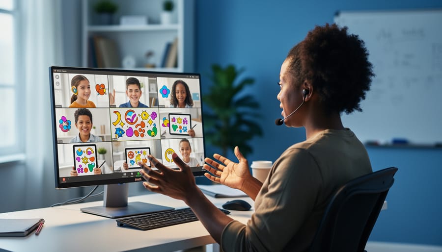
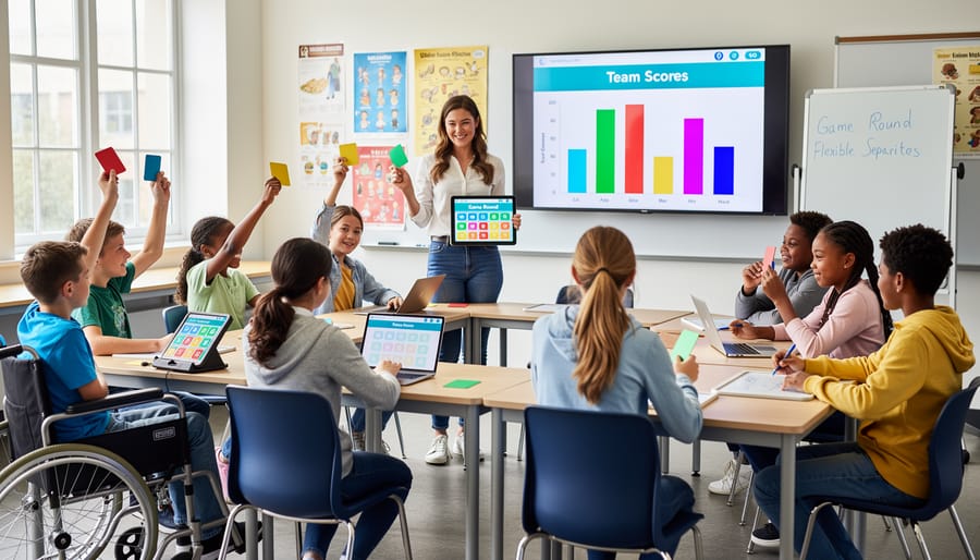
Not every student feels comfortable responding the same way, and that’s perfectly okay! When running remote games, give your students choices in how they participate. Some might love shouting answers out loud, while others prefer typing quietly in the chat. By offering multiple response methods, you create a welcoming space where everyone can shine.
Consider setting up different participation channels for each game round. Let students use virtual hand-raising tools, chat boxes, verbal responses, or even emoji reactions. You might be surprised how much more engaged your quieter students become when they can respond through chat instead of speaking up. Meanwhile, your energetic learners can still share their enthusiasm verbally.
Mix it up throughout your game session too! Try one round where everyone types answers, another where you call on raised hands, and maybe a lightning round where students hold up physical answer cards to their cameras. This variety keeps things fresh and ensures every learning style gets a moment to excel. The best part? When students can choose their comfort zone, anxiety drops and participation soars.
Timing and Pacing Adjustments
Not everyone processes information at the same speed, and that’s perfectly okay! One of the simplest yet most powerful adjustments you can make to your remote classroom games is giving students control over timing and pacing.
Start by building flexibility into any timed activities. Instead of locking everyone into a strict 30-second timer, consider offering options like 45 or 60 seconds. Even better, include a pause button so students can take a breather when they need it. This small change makes a huge difference for students with processing differences, English language learners, or anyone who simply needs an extra moment to think.
When you’re using PowerPoint templates for game-based activities, avoid automatic slide transitions that rush students forward. Let them advance at their own pace by using manual click-through navigation instead. This way, every student gets the time they need without feeling pressured or left behind.
Here’s a fun customization tip: create different difficulty levels that vary not just in content complexity but also in time allowances. Your quick thinkers can challenge themselves with shorter timers, while students who need more processing time can work comfortably without stress.
Remember to communicate clearly about timing expectations upfront. Tell students whether an activity is timed or self-paced, and always give warnings before time runs out. A simple “one minute remaining” announcement helps everyone prepare rather than panic.
The beautiful thing about flexible timing? It reduces anxiety for all students and often leads to more thoughtful, creative responses.
Content and Language Accessibility
Clear and Simple Instructions
When creating game content for your classroom, keeping instructions crystal clear makes a world of difference for all learners. Start by breaking down multi-step directions into simple, bite-sized chunks. Instead of “Navigate to the correct answer by clicking the corresponding shape,” try “Click the shape with the right answer.” See the difference?
Use short sentences and everyday words that match your students’ reading levels. If you’re teaching elementary students, avoid terms like “utilize” when “use” works perfectly. For questions, stick to direct language: “What is 5 + 3?” beats “Calculate the sum of five and three.”
Here’s a quick tip: read your instructions out loud. If you stumble or need to reread something, your students probably will too! Consider adding numbered steps when explaining game rules (1. Read the question. 2. Pick your answer. 3. Click to check.). This sequential format helps students follow along without confusion.
Remember to define any subject-specific vocabulary before diving into gameplay. A quick glossary slide or pop-up box can work wonders. When everyone understands the rules from the start, they can focus on learning instead of decoding complicated directions. Your games become more inclusive and way more fun for everyone involved.
Supporting Multiple Languages and Reading Levels
Making your classroom games accessible across reading levels and languages opens doors for every learner to participate fully. Start by simplifying your instructions—break down complex directions into short, numbered steps that students can follow easily. When creating PowerPoint game templates, use straightforward vocabulary that matches your students’ grade level, and consider including visual cues alongside text to support comprehension.
For multilingual classrooms, add translations of key instructions or vocabulary terms directly on your slides. You can create duplicate slides with translated content or use text boxes in different languages side-by-side. Many free translation tools make this quick and manageable, even if you’re not multilingual yourself.
Customize reading levels by preparing multiple versions of the same game with varying text complexity. Your advanced readers can tackle longer passages while emerging readers work with simplified versions of the same content. This approach lets everyone play together while meeting individual needs.
Don’t forget about font choices—stick with clean, sans-serif options that improve readability for all students, including those with dyslexia. Keep font sizes at 24 points or larger for body text, making content visible during screen sharing.
These small adjustments create big wins for inclusion, ensuring language barriers and reading differences never stop your students from enjoying the learning experience.
Quick Accessibility Checklist for Your Game Templates
Before you launch your next PowerPoint game in your remote classroom, take two minutes to run through this quick checklist. Think of it as your accessibility insurance policy – it ensures every student can participate and succeed!
Start with visuals. Can you read all text from six feet away? Check that your font size is at least 24 points and you’re using clear, simple fonts. Make sure there’s strong contrast between text and backgrounds – light text on dark backgrounds or vice versa. Avoid relying solely on color to convey information. If red means “incorrect,” add an X symbol too.
Next, consider audio elements. If your game includes sound effects or music, provide visual alternatives like text cues or animations. Always include captions for any spoken instructions or video clips.
Check your navigation. Can students move through the game using only a keyboard? Test this yourself by trying to play without your mouse. Ensure clickable areas are large enough – aim for buttons that are at least fingertip-sized.
Review your instructions. Are they clear and concise? Read them aloud to check if they make sense without visual context. Consider providing both written and verbal directions.
Finally, think about timing. If your game is timed, can you easily adjust time limits? Some students need extra processing time to succeed.
Remember, these small adjustments take minutes to implement but make a world of difference for your learners. You’ve got this!
Here’s the wonderful news: when you design accessible games, you’re not just helping students with specific needs—you’re making learning better for everyone! Clear visuals reduce confusion for all students. Flexible timing helps those who need a moment to think through their answers. Multiple ways to participate means every learner can shine in their own way.
Don’t feel overwhelmed by the idea of making everything perfect right away. Small changes truly make big differences. Start with one or two adjustments—maybe increasing your font size or adding visual supports—and build from there. Each tweak you make creates a more welcoming space for your students.
Remember, accessible design strengthens your entire inclusive learning community. When students see that their needs matter and that everyone can participate fully, they feel valued and ready to learn. Your effort to customize games shows students that their success is your priority.
You’ve got this! The strategies you’ve learned today are practical, doable, and impactful. By embracing accessible design in your PowerPoint games, you’re creating opportunities for every student to engage, learn, and celebrate their achievements together.